I heartily agree with Cogit8tions and Heresiology. That new UUA logo is not attractive.
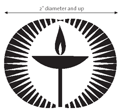
UUA.org says "The new UUA logo is designed to convey the idea of light emanating from the flame, or illumination."
The message this almost-cross conveys to me is "See! We're like Christians, but, you know, not!" Not cool. The new symbol would be hard to draw and I hate that the bottom of the chalice glows just as much as the top part with fire on it. Maybe I'm nitpicking, but that's just stupid.
It kind of suggests an eye, but mostly looks weirdly old. The chalice itself looks OK, but the glowing stuff around it has to go.
Indrax's idea points out that the symbol of a religion and the symbol of a denomination aren't the same thing. E.g. The symbol of Christianity is a cross. The symbol of the Presbyterian Church USA, is this cross:

Indrax said a symbol of a faith should be something that is easy to draw. He and Jamie Goodwin of Trivium came up with a teardrop-and-partial-oval thingy that looks like this:
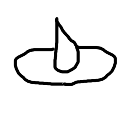
Looks OK to me as an informal symbol. But that doesn't change the fact that the new UUA logo, which I'm sure somebody worked really hard on, is derivative and not cool. Cogit8tions' comparison to a decades-old bank logo seems quite apt.
I find myself asking this often of the UUA. Can't we do better?
CC
15 comments:
So much of what UUs do seems amateurish. Perhaps we like it that way?
I don't like it as much as the old one either. It's clunky and ungraceful. And symmetry is less sophisticated than asymmetry, and more formal.
I don't like it either.
For an even more basic reason: it's not a chalice.
A chalice is a goblet. It has a bowl or cup on top, a stem, and a base. It's deep enough to hold a drink.
This thing may be a torch, if you use your imagination, but it's not a chalice. It has no base. If you put it on your dinner table it would fall over. Its cup is a little deeper than the last one, but still not deep enough. It looks like something an exhausted, sweaty runner would ignite at the opening ceremony of the Olympics.
Having said all that, it does meet what I think are the minimum necessary elements of the UUA logo:
1. Two intersecting circles, representing the merger of our two predecessor traditions.
2. A chalice (even though this one lacks its base).
3. Flame on top of the chalice.
4. A vaguely cruciform shape, representing our origins in Christianity.
Some "flaming chalice" logos that omit the two circles may look better, but as a denominational logo they are incomplete. Same goes for those with chalices that are not somewhat cruciform.
I kind of like it, but probably for a reason I don't share with y'all. To me, it closely resembles the depiction of Amida Buddha, the central figure of Jodo Shinshu, the Universalism of the Buddhist world. Amida emits countless rays of light that travel throughout the universe and embrace all beings, naturally bringing them to peace and enlightenment. Iconographically, this is often shown as 48 beams of light emanating from a Buddha figure (though the true Buddha is without form, is in fact light--aka wisdom--itself). The new chalice mirrors this motif by showing rays of light that reach in all directions to dispel darkness and touch all beings.
The message it sends me is "We're like Christians, see.. except we want Jesus to be on FIRE!"
Seriously, I tend to agree with fausto. It's not so much "bad" as it is "aggressively mediocre" - and it definitely sends a "designed by committee" message. Which may well make it an excellent symbol for the UUA.
My main concern is that this new UUA logo will be used as a *denominational* logo, when it should be *only* used for the actual UUA. Because Unitarian Universalism is not the UUA. The UUA, as often as many lose sight of this, is a *subset* of Unitarian Universalism.
I like it, i mean I'm not going to paint a big one on my garage door or anything, and i wouldn't want it used by my Church, but it works fine for the UUA.
I just got my church's monthly newsletter with the fuglychalice on it, it looks like they added a base.
Um, the one your friends designed looks like a fudge drop cookie with a Hershey's kiss in the middle.
The UUA is a subset of the Unitarian Universalism? I like to say, "The UUA is the member congregations. The people who work for us at 25 Beacon Street, providing services to the local congregations, are NOT 'the UUA!'"
And feel free to add a "dammit!"
Merry Christmas.
I think the previous posters point was that the Member congregations of the United States do not make up the entire denomination of Unitarian Universalism.
It looks fine to me. I always thought the old chalice symbol looked a bit lopsided. But I like my designs to be very symmetrical for the most part.
I do wish it had a base, but that would look weird inside the eye thing.
I like the eye thing - it reminds me of a heart.
I was reading about the symbology of the flaming chalice and came across this page What is the Flaming Chalice?. Most interesting to me in regards to the old chalice being lopsided: The chalice is set off-center, to indicate that we do not believe our way in religion to be the only way. I guess we ditched that part with the new chalice.
I don't think that the only way to show our religion isn't the only way is to show a lopsided chalice, though. Having all those little points of light (apologies for the phrase, it's 1 in the morning!) pointing in all the many directions could mean the same thing.
But really it comes down to aesthetics, and it's not that crucial to me. I have a chalice necklace and it's not lopsided, nor is it surrounded by a heartful eye.
In years past I was active in this feminist student collective that organized a production of the Vagina Monologues. I also helped pickup the logo for that production.
That was on my mind when I ran into the new logo at GA this year. My reaction was, "Awesome! Someone came up with a vaginal chalice design!" I didn't know it would be the new UUA logo. I was very happy to find that out then.
When I first saw it, I thought, "Wow, that looks like the old Starbucks logo."
I agree it looks ugly. I also totally agree with the non-Christian bit. We really have nothing in common with Christianity that we don't with any other religion. I'm personally sick of sucking up to Christians; I'm pagan, and the principles correspond perfectly to Unitarian Universalism. We are not similar to Judaism or Islam either. Sure we respect all religions, but there are clearly some we resemble more than others, and the monotheistic dogmatic ones are at the bottom of the list.
Just my rant; in short I like the old symbol the best.
Post a Comment